The landscape of the music industry has undergone a radical transformation over the past two decades. While the global market heavily pivoted toward digital streaming platforms, K-pop defied the norm by doing the exact opposite: making physical albums more relevant than ever. What was once a simple plastic jewel case housing a CD and a flimsy lyric booklet has evolved into a massive cultural phenomenon. Today, unboxing a K-pop album is a multi-sensory experience that fans eagerly anticipate and share with the world.
This survival and subsequent boom of physical media in the digital age didn’t happen by accident. Entertainment agencies realized that to make fans buy physical albums, the product needed to be more than just a music delivery mechanism. It needed to be a tangible extension of the artist’s universe. Consequently, K-pop album design transitioned from basic merchandise into a sophisticated form of contemporary art, reshaping how we define music memorabilia.
The Era of the Jewel Case: Where It All Began
The Standardized Plastic Box
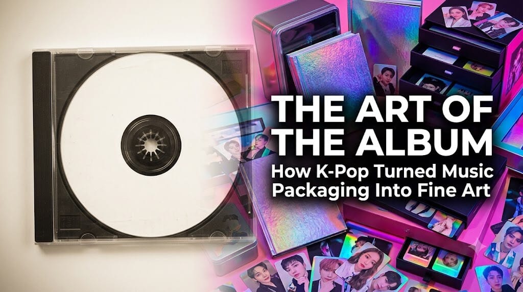
In the late 1990s and early 2000s, K-pop followed the global standard of music packaging. Albums were housed in standard square jewel cases. The focus was entirely on the disc itself, with visual elements restricted to a small front cover insert and a back inlay. For early generations of K-pop fans, the excitement was purely about listening to the tracks and reading the printed lyrics in tiny font.
The Shift Toward Photobooks
As the competition grew fiercer in the mid-2000s, agencies began experimenting. They realized that fans deeply connected with the visual concepts of their favorite idols. The standard jewel case expanded to include thicker booklets, eventually giving birth to the standalone photobook format. This marked the initial shift from “music packaging” to “visual merchandising,” laying the groundwork for the design revolution that was to follow.
The Concept of ‘Objet D’art’ in Modern K-pop
Defining the Album as an Art Piece
Today, a K-pop album is no longer designed to fit neatly on a traditional CD shelf; it is designed to be displayed proudly as a centerpiece. Designers utilize unconventional materials—ranging from acrylic panels, holographic foils, and fabric textures to tin cases and literal canvas bags. The album has become an objet d’art (an object of art), an item that possesses aesthetic value independent of its functional utility.
Translating Complex Lore into Physical Form
Modern K-pop is deeply rooted in “lore” and cinematic universes. Groups like EXO, BTS, aespa, and NewJeans build intricate storylines that span across multiple comebacks. The album packaging serves as the physical manifestation of this lore. For instance, an album might look like a retro VHS tape, a futuristic cybernetic core, or a mystical fairy-tale book. Every color choice, structural mechanism, and hidden graphic serves as a clue for fans to decode, making the packaging an interactive narrative tool.
The Psychology of the Unboxing Experience
More Than Just a CD: The Inclusion Ecosystem
What actually goes inside a modern K-pop album? The CD has almost become a secondary feature. The core value lies in the meticulously curated inclusions:
- Photocards: The ultimate modern collectible, driving massive economic value and fan engagement.
- Postcards & Posters: High-quality conceptual photography meant for room decoration.
- Stickers & Bookmarks: Interactive elements that allow fans to customize their belongings.
- Hidden Tracks & Zines: Exclusive content that cannot be found on streaming platforms.
Structural Engineering and Sensory Delight
The physical act of opening a K-pop album is carefully engineered. Designers use magnetic closures, drawer-style boxes, origami-inspired folding mechanisms, and vacuum-sealed packaging to create suspense. The tactile sensation of different paper weights, the smell of fresh ink, and the visual pop of opening a well-designed box trigger an emotional reward system, turning the consumer into a collector.
Sustainability vs. Collectibility: The Future Sub-text
The Environmental Dilemma
With the massive success of physical albums comes a growing criticism regarding environmental sustainability. Because fans often purchase multiple copies to support their favorite artists in chart rankings or to collect rare photocards, the excess plastic and paper waste have become significant concerns. The industry has faced pressure to innovate not just aesthetically, but ethically.
The Rise of Eco-Friendly and Digital-Hybrid Formats
In response, the design paradigm is shifting once again. Agencies are increasingly adopting FSC-certified paper, soy-based inks, and biodegradable plastics. Furthermore, the industry introduced “Platform Albums” or “Poca Albums”—minimalist, pocket-sized packages that contain only a photocard and a QR code to download the music digitally. This hybrid approach proves that K-pop packaging design can adapt to modern ethical standards without losing its collectible charm.
Writer’s Opinion
Looking at a modern K-pop album, I am consistently amazed by how a supposedly dying medium was resurrected into a thriving art form. To me, these albums are no longer just music products; they are time capsules of creative direction. K-pop agencies geniusly recognized that in a world where everything is digital and ephemeral, people still crave physical ownership and tangible connection. While the industry must continue to solve its environmental footprint, the sheer creativity poured into these structural masterpieces has permanently elevated album design into the realm of high art.